Role
UX/UI Designer
Duration
November - May 2023
Worked With
Dawson Jen, Mai Nguyen,
Soomin Lee and Grace Yu
Tools and Skills
Overview
In a world full of cooking apps, many bombard users with dense text and make it difficult to find the desired recipe. Recognizing the absence of user-friendly cooking apps, our project aims to address this gap by creating a social media platform tailored for novice to intermediate cooks. With a focus on accessibility and inclusivity, we seek to provide a solution to the challenges users face, such as unclear recipes and uninspiring interfaces, while fostering a sense of community and collaborative learning within the cooking sphere.
Crafting tailored questions, we gathered insights from diverse interviewees, including a range of cooking enthusiasts, to uncover app solutions addressing cooking challenges and milestones, aiming to develop a community-centric cooking platform.
Our group then created user personas based off these interviews then delved into their concrete tasks and challenges faced by our interviewees.
These narratives illustrate the diverse challenges individuals face in their culinary endeavors and meal planning routines. For Sam, the focus lies on balancing culinary education with personal creativity, while Sierra navigates the balance between her passion for cooking and her academic responsibilities. Eunice, on the other hand, grapples with meeting the varied preferences and schedules of her family members while ensuring nutritious and enjoyable meals. Understanding these unique perspectives is crucial for designing solutions that cater to individual needs and enhance overall culinary experiences.
Drawing from our user research interviews and personas of those within the cooking community, our team created a comprehensive list of platform requirements, encompassing essential features, enhancements for user experience, and exclusions to target specific pain points. Prioritizing these requirements, we aim to deliver a platform that addresses user needs and enhances the cooking experience.
Must Include:
- Recipes with user-generated content.
- Photos for visual guidance.
- Time estimates for planning.
- Ingredient lists for preparation.
- Detailed cooking instructions for best results.
Should Include:
- Ingredient alternatives for allergies or availability.
- Recipe reviews for authenticity and difficulty assessment.
- Allergy warnings for safety.
- Save/share options for reference and sharing.
- Filtered categories for tailored recipe discovery.
Could Include:
- Explore page for discovering new recipes.
- Following system for building a cooking community.
- Navigation bar for easy recipe search.
- Cooking history for revisiting saved recipes.
- Cooking suggestions based on user preferences.
Exclude:
- Unfiltered comments to prevent hate speech.
- Excessive notifications to avoid user irritation.
- Chatting programs due to privacy concerns.
- Emotes unnecessary for app functionality.
- Location tracking for user privacy.
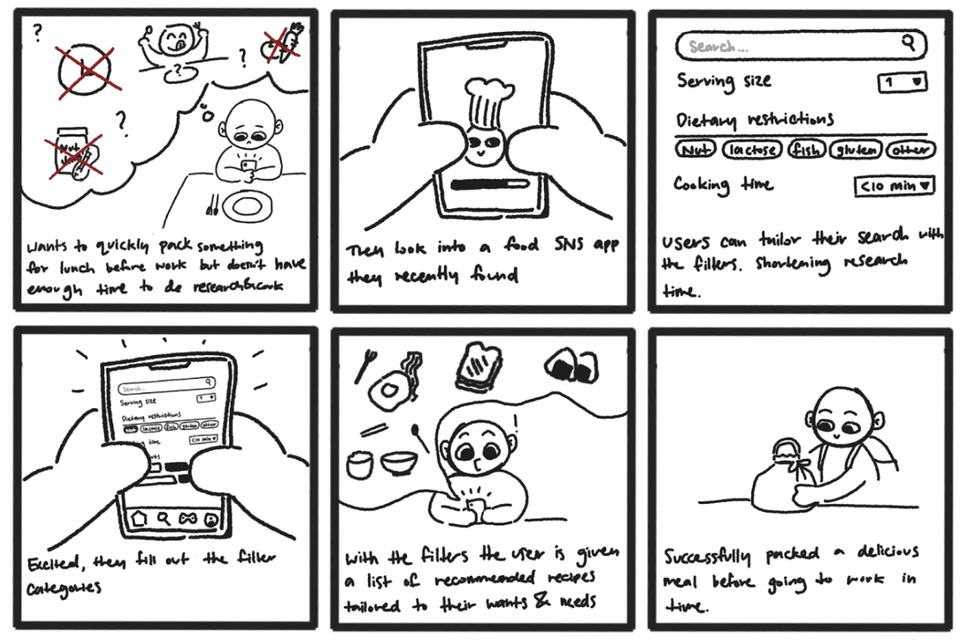
The group decided to work on the sketches individually to each address the problem at hand (lack of connectivity between those with a passion for cooking) with unique perspectives.
After reviewing the collective sketches, we identified similarities among several of them and formulated three alternative solutions for a potential app idea aimed at addressing the usability issues encountered in cooking applications. The sketches are as follows:
Ingredient-Based Recipe Finder
An ingredient-based recipe finder app tailored to users' current ingredients, lacking community engagement.
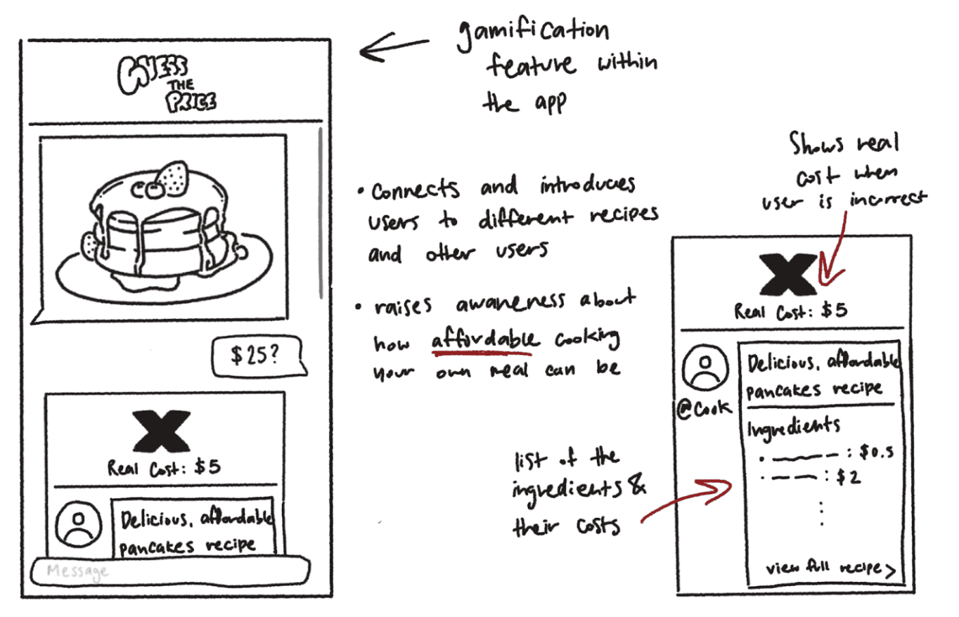
Guess the Price Cooking Game
A cooking game where users guess recipe prices to connect and explore new recipes, potentially limited by ingredient accessibility and unnecessary steps.
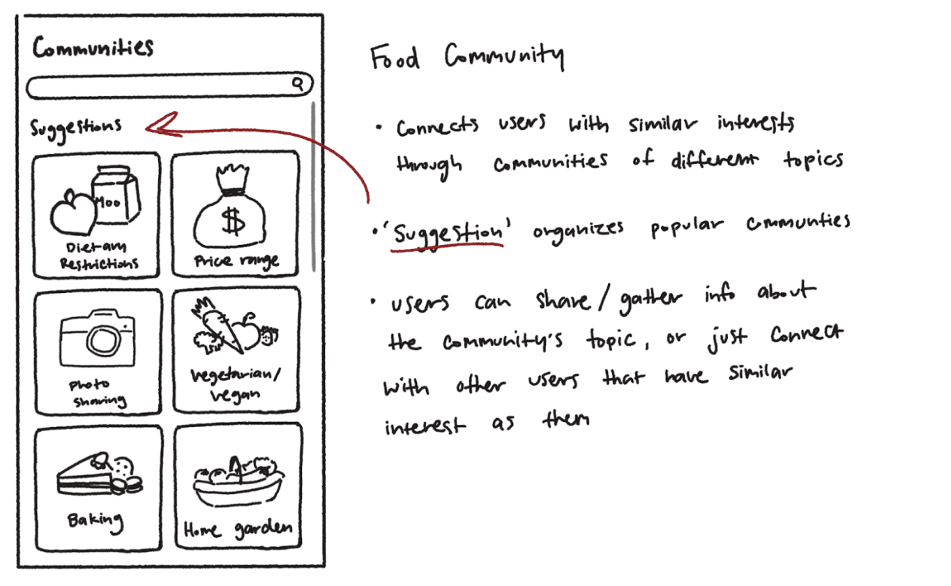
Food Community Connection Platform
A food community app facilitating recipe sharing and connections among users with similar cooking interests, combining the strengths of the previous ideas.
Among our brainstormed app ideas, the first concept offered an ingredient-based recipe finder, tailored to user ingredients but lacking community engagement. The second idea, a cooking game called "Guess the Price," aimed to connect users through guessing recipe costs, yet it relied heavily on ingredient availability and introduced unnecessary steps. Lastly, the third idea proposed a food community app, combining recipe sharing with connections among users of similar cooking interests. Recognizing its strengths in addressing community engagement and recipe sharing, our group ultimately chose to pursue the third sketch.
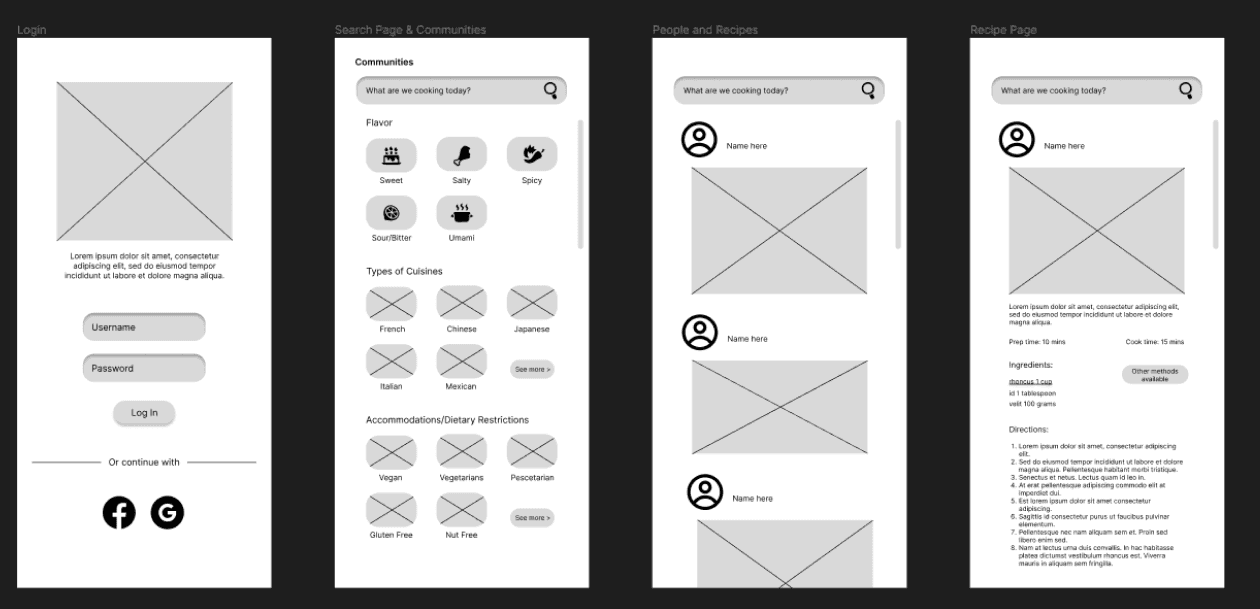
During prototype creation, we grappled with layout challenges on recipe and community pages, emphasizing clarity and hierarchy. Iterating designs aimed for user intuitiveness, highlighting simplicity to prevent overload. Low-fidelity prototypes prioritize functionality, resulting in clearer navigation for users. Our focus on diverse categories and essential functionalities ensures efficient task implementation and user engagement.
Mobile Prototype
Our group then conducted cognitive walkthroughs involving predefined tasks not disclosed to users. These tasks were categorized into two primary objectives: firstly, assessing users' ability to open a recipe from the homepage, and secondly, gauging their proficiency in filtering through recipes.
While successful overall, both candidates struggled with filtering recipes, partly due to the location of the filters in the hamburger menu. Additionally, they were uncertain about the purpose of the 'community' tab, raising questions about the app's focus.
Minor inconsistencies, like swapping 'chat' and 'share' positions, were noted, along with suggestions for terminology improvements.
Comparing the walkthroughs, both candidates easily opened recipes from the homepage, but tended to click the entire box rather than the call-to-action button.
From these walkthroughs, we identified three key areas for enhancement:
Homepage:
- Conflicting intentions between "share" and "chat" buttons.
- Suggested prioritization of share feature over chat to avoid confusion.
- Concerns about relevance of "community" tab in menu; suggests engagement with other chefs online, conflicting with platform's focus on home chefs.
- Proposed relocation of community tab to homepage for better alignment with platform's goals.
Login Page:
- Confusion due to unconventional intuitive design.
- Separate forms for logging in and signing up with interactive toggles suggested.
- Redundancy in "login" button.
Search Filters:
- Complexity of numerous filter options overwhelms users.
- Proposed solution: Group existing filter options into broader categories for efficient navigation.
- Visual improvements: Enlarge icon for filtering options, reposition search bar towards the center for better visibility.
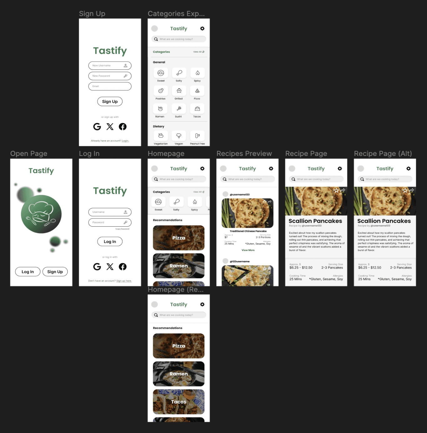
Based on our low-fidelity prototype and the feedback from our cognitive walkthroughs, we made several adjustments to our high-fidelity prototype to address the identified pain points. Specifically, on the homepage, we removed the 'chat' and 'community' options as they were redundant. Users can already comment on other people's recipe postings and explore similar features through the 'explore' tab.
We also improved the login page by clearly separating the sections for logging in and signing up. Additionally, we grouped the search filters and shown recommendations into specific categories for more efficient navigation, and we enlarged the icons for better visibility.
Our group conducted heuristic evaluations with three qualified experts, ranging from graphic designers to UX/UI professionals. Before the evaluations, we prepared a list of predefined tasks for the users to complete, but we did not share these tasks explicitly, aiming to assess the intuitiveness of our design.
—
1st Iteration
Positive feedback highlighted the effective use of images as widgets and the horizontal scroll for food categories. However, there were concerns about the platform's lack of social features, making it feel more like a recipe site rather than a social cooking platform. The experts also noted issues with button interactions and sizes, specifically the impractical hover states on a mobile interface. Additionally, some features, like the dietary restriction toggle on the ‘Recipe’ page, felt unintuitive.
Taking this feedback, we then iterated upon the design even further to improve Tastify’s UI to the best of its capabilities.
—
Feel free to view the complete prototype:
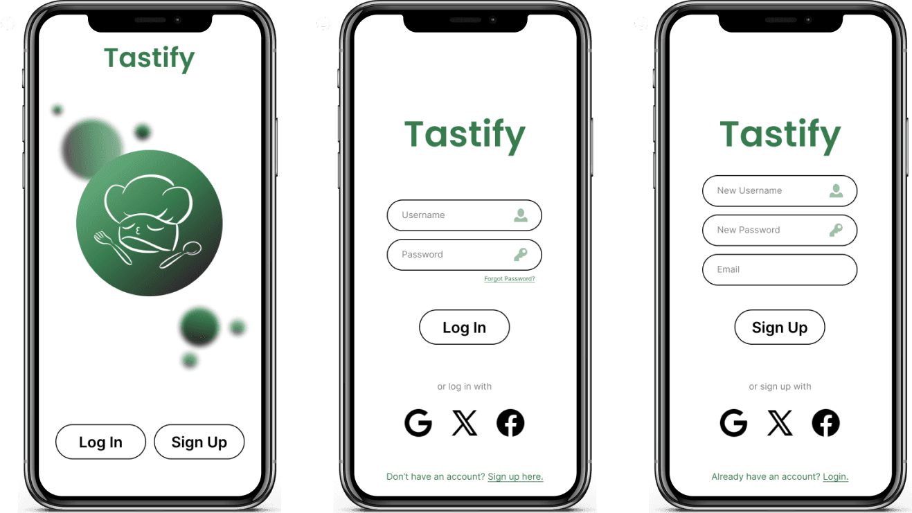
(1) (2) (3) Welcome to Tastify! On the opening screen, users can choose to log in or sign up. Either option allows users to sign in with affiliated accounts if applicable.
Disclaimer: For this walkthrough, we will assume the user already has an account, as our focus is on creating an accessible and engaging cooking community.
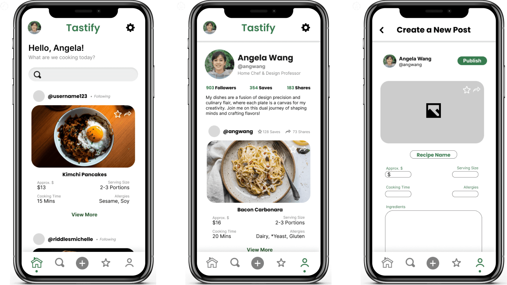
(4) Upon logging in, the user is greeted with their homepage, displaying the accounts they follow and the recipes shared on their profile.
(5) To view their own profile, the user can click the human icon in the bottom menu. This profile page shows their name, handle, followers, saved recipes (which are also accessible through the menu option), and the number of shares. It also displays all the recipes the user has posted.
(6) By clicking the plus icon in the center of the bottom menu, users can create a new post. This action brings up a template for users to fill in with their recipe details.
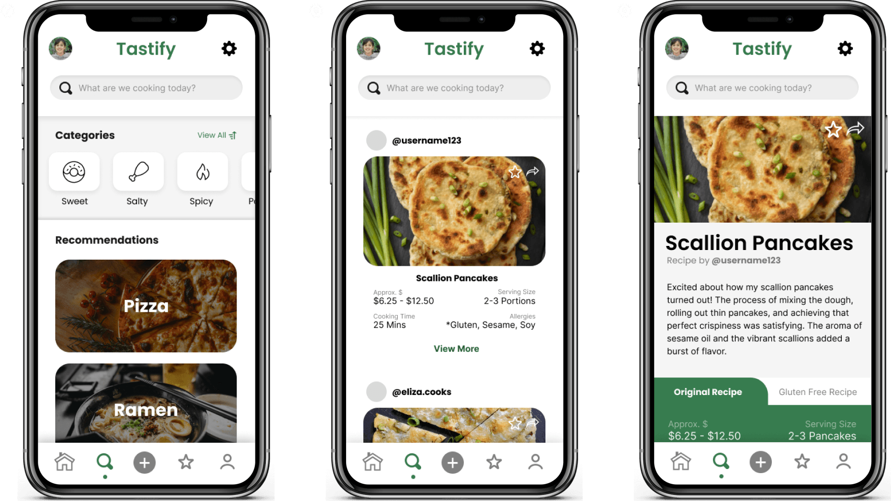
(7) Clicking the search button takes users to the explore page, where they can discover new recipes. This system provides recommendations based on trends in their saved recipes. Users can also filter their searches through various food categories to match their cravings.
If a user has a specific recipe in mind, they can search for it using the search bar at the top of the explore page, which is accessible at any time.
(8) After the user searches for a recipe, their page will display a variety of recipes posted by other users on the platform for them to explore. The previews provide information such as the estimated cost of the recipe for accessibility, serving sizes for convenience, cooking time, and any allergy warnings. If a recipe has a star next to one of the allergies, it means that an alternative recipe option is available for the user.
(9) Users can follow the recipe instructions and switch to an alternative recipe tab if available. To avoid overwhelming users with long blocks of text, we organized the instructions into pages. This allows users to flip through the steps one at a time, making the process more manageable.
The ‘final’ design will never truly be the final copy.
You may have noticed throughout reading the last portion of this case study that I have been putting ‘final’ in quotation marks. This choice reflects the ongoing nature of refinement and improvement, even after reaching what seemed like completion. Despite conducting numerous user tests at every stage of prototype development, a continuous stream of feedback highlighted areas for further enhancement or refinement.
While it's crucial to acknowledge that catering to every individual preference is unrealistic, I found that this principle holds true across all design endeavors. Design is inherently subjective, and what works perfectly for one user may not resonate with another. Therefore, the goal should be to create a design that satisfies the needs and preferences of the majority while still being flexible enough to accommodate diverse user perspectives. By embracing this diversity and continuously seeking feedback, designers can create more inclusive and user-friendly solutions that better serve the needs of a broader audience.
In order to create human-centered designs, consider various skill levels and backgrounds.
The heuristic evaluation revealed the importance of considering user perspectives, as details overlooked by creators became apparent. Key learnings included the necessity of integrating community aspects, as well as adding features like videos, reviews, and hashtag functionality for improved user engagement beyond what the ‘final’ design had to offer.
Additionally, incorporating a diverse range of users, from novices to seasoned UX/UI designer experts, to test the application enabled a comprehensive evaluation of its usability and effectiveness. This diverse testing pool ensured that feedback encompassed perspectives from various skill levels and backgrounds, facilitating a more thorough understanding of user needs and preferences.

