Role
Graphic Designer
Duration
February - April 2024
Worked With
Angela Li, Yousuf Zia
and Giang Tran
Tools and Skills
Overview
Fostering creativity and collaboration, Socratica offers weekly co-working sessions for individuals pursuing passion projects.
Weekly co-working sessions at Socratica culminate in the Symposium, a focused gathering where participants showcase passion projects developed throughout the year. This event fosters exchange of feedback and connection within a like-minded community, attracting over 700 guests from diverse fields like tech and art.
Initial Thinking
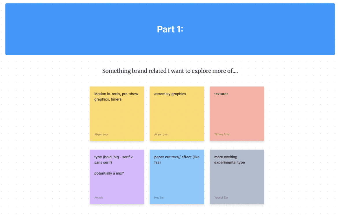
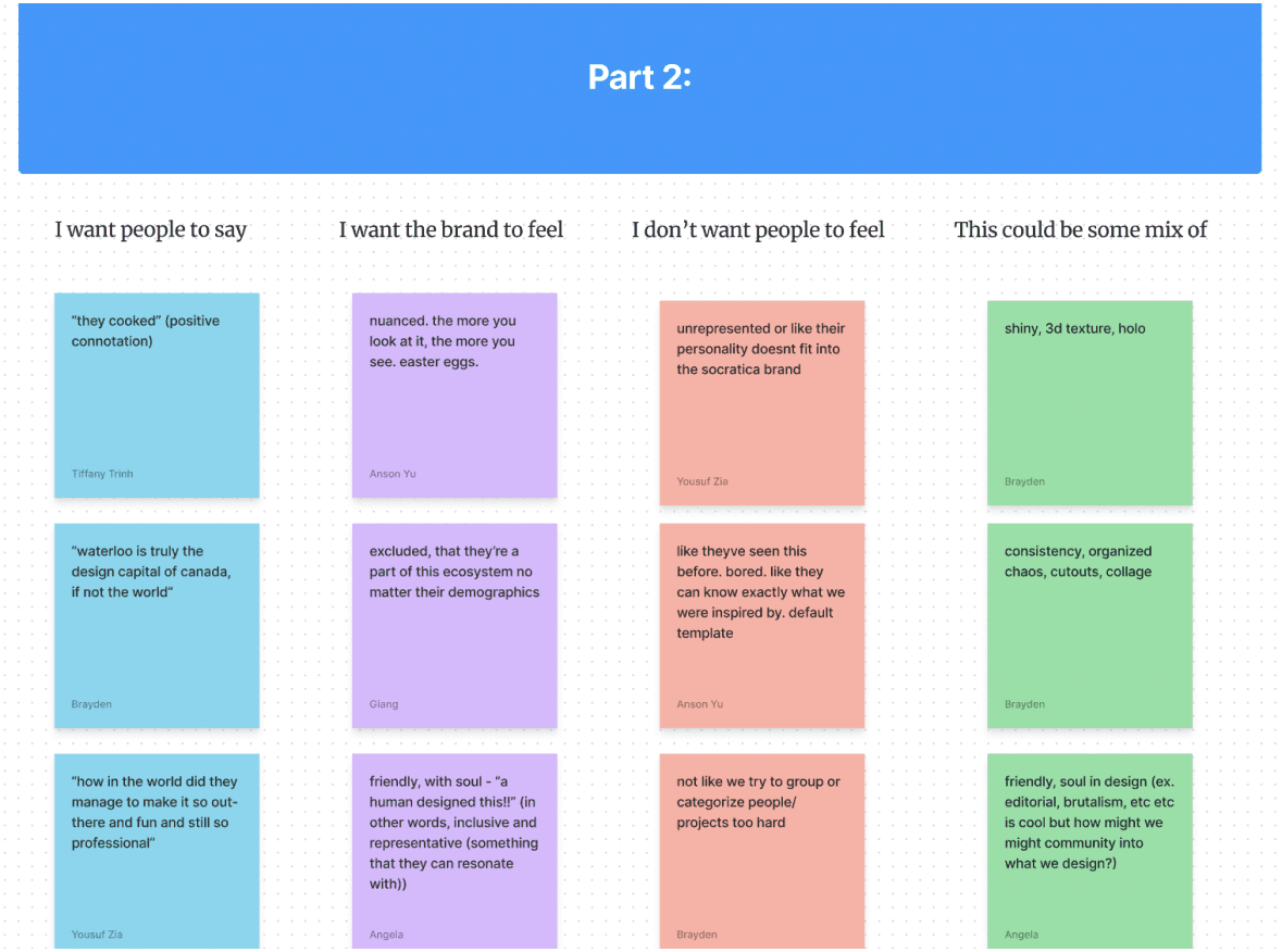
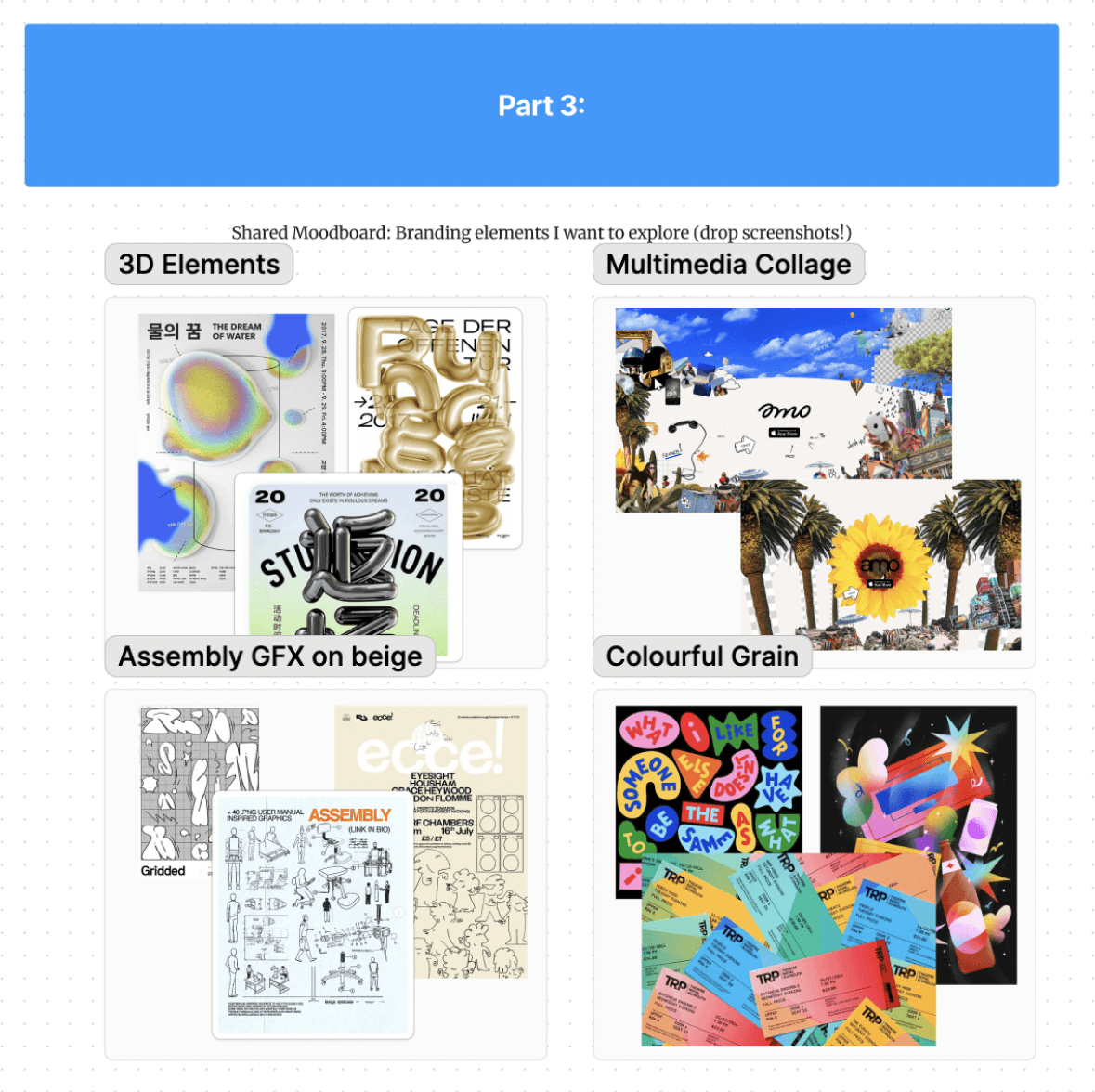
The Socratica team hosted a team-wide call for brainstorming the initial branding of what W’24 Symposium would be. We had split our thinking into three parts:
Establishing Brand Exploration
Emotion Design Objectives
Collaborative Moodboard
Each person would spend approximately 6 minutes filling out their ideas onto a Jam-board. The overall consensus landed on the following for each section:
3D Mascots
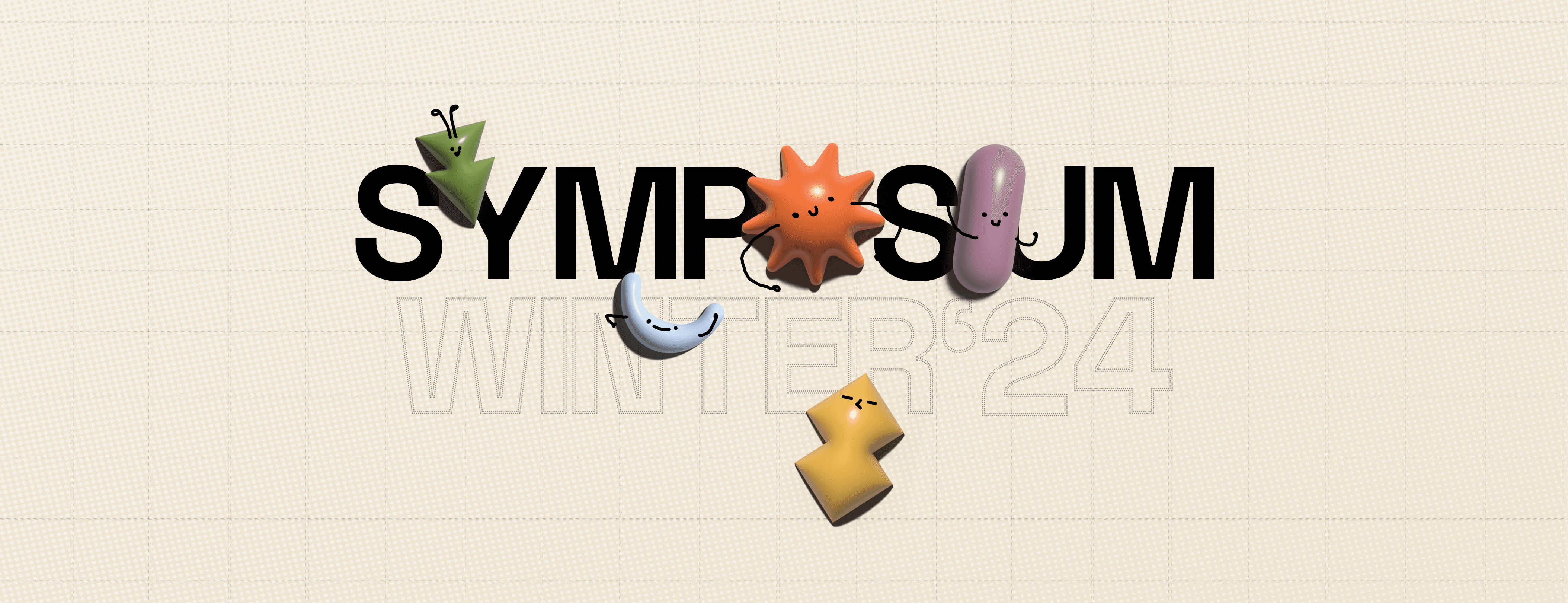
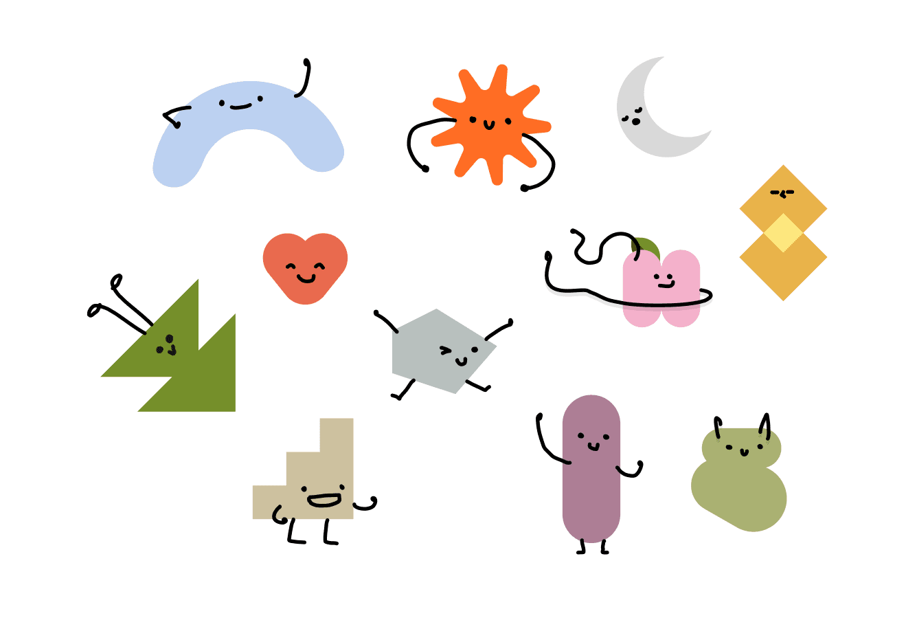
Following the brainstorming session, each designer individually crafted a Luma banner, which would later be merged into a cohesive design. Drawing inspiration from the concept of integrating 3D elements into Symposium's branding, I expanded upon Socratica's existing mascots by incorporating them into the design.
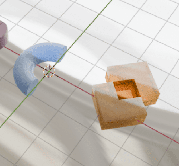
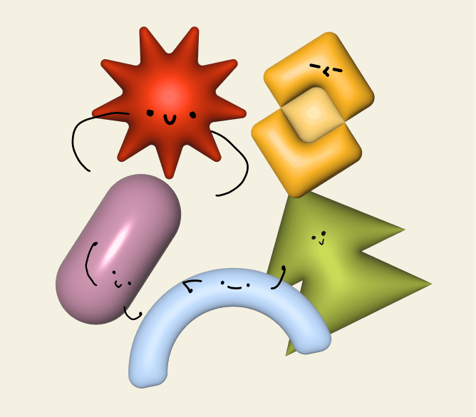
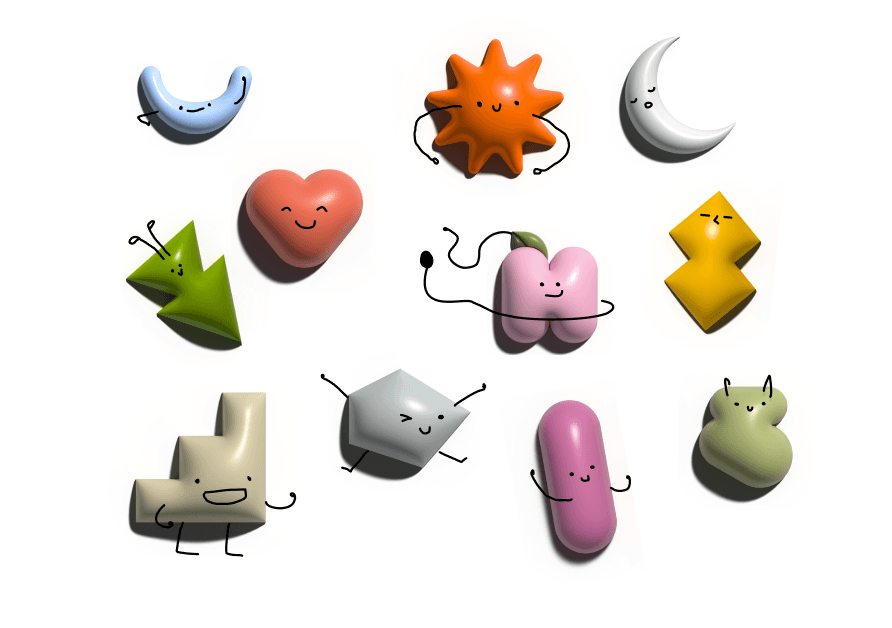
Initially, I began crafting the inflated mascots in Blender, but soon realized that the design's transferability was limited. Consequently, I transitioned to rendering the shapes in Illustrator, then drawing the faces onto them afterwards using Figma’s pen tool.
Original Mascots
Blender Renders
Half Rendered Inflated Mascots
Final Rendered Masscots
This progression culminated in the designers crafting their individual Luma Banner designs, integrating these newly created 3D assets. Each designer brought their unique interpretation of the ideas generated during our brainstorming session. The rationale behind creating individual designs was to facilitate a collaborative process where we could later gather, identify specific elements and styles from each designer's work, and merge them into the final graphic collectively.
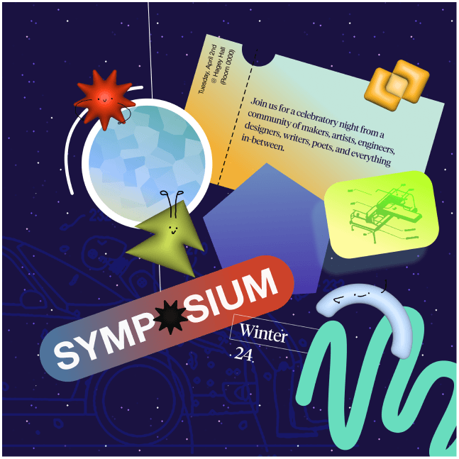
Yousuf's Design
Angela's Design
Giang's Design
My Design
Key insight gained from the individual designs, when amalgamated and helped us form our final design included:
Bright vibrant colours against bright mascots don’t mesh well together
None of us had included assembly graphics as originally planned
Colour balance is important
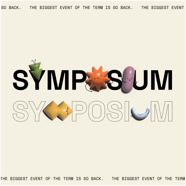
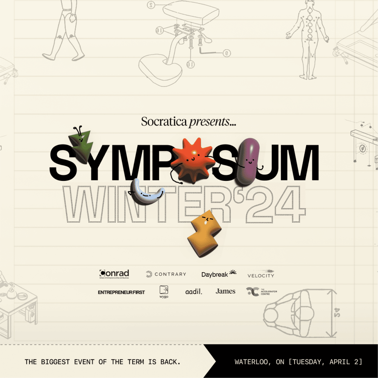
Therefore, through collaborative iteration and merging of our designs, we created the subsequent Luma banner. The light beige background provides a gentle backdrop, complemented by vibrant 3D mascots for a splash of colour. Additionally, we integrated subtle assembly graphics in the background, imparting a sketchy, "work in progress" aesthetic to the overall graphic while filling the space effectively. This allowed for our design to align with our initial brainstorming concept, incorporating all ideas, and enhancing the cohesion in the design.
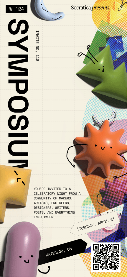
TICKET DESIGN
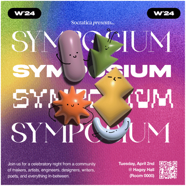
Our iterative process of the design didn't stop there. We continued to play around with inclusion of colours, textures, and compositions on our ticket design to satisfy our original ideas when moodboarding (collage style, colourful grain, assembly GFX, and 3d elements).
This ticket design then established the overarching branding and thematic direction for the event's other assets.
OTHER ASSETS
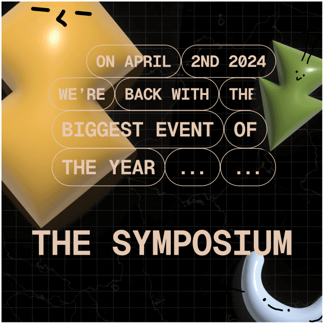
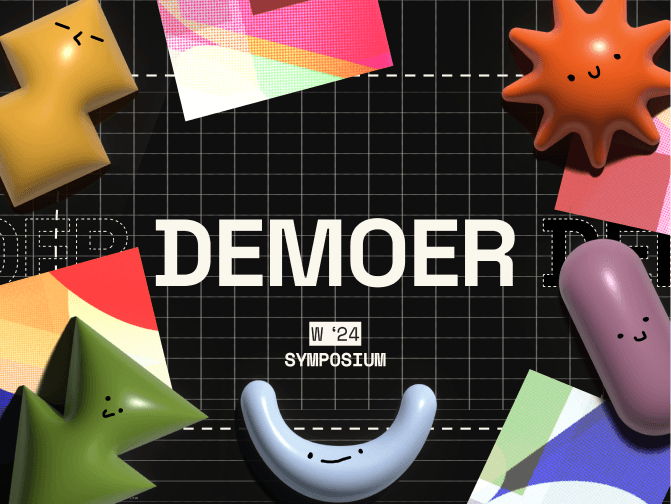
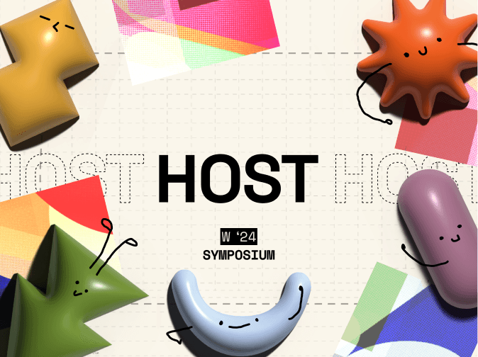
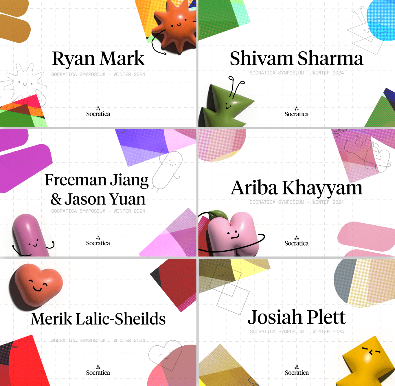
To elevate the event experience, I took on creating wristbands, booth signage, and lanyard nametags based off of the established design done for the ticket.
Effective design collaboration requires objectively filtering diverse opinions.
Collaborating with several designers and sharing with a large group (think 20+ people) inevitably leads to diverse feedback based on personal preferences.
While all input can be valuable, prioritizing user needs becomes crucial. As a designer, it's about identifying the graphic's core purpose and focusing on that.
In collaborative projects, designers express their identity.
While the initial direction for the Symposium design developed from the designer’s collaborative process, I feared if my contributions to the overall design made a meaningful difference, given the multitude of ideas being explored by the team.
However, the more I worked on this project, I found opportunities to incorporate my design strengths as the project progressed. This included exploring areas I enjoy, like 3D rendering, character design, and a more expressive use of color.

