Role
Lead Graphic Designer
Duration
February 2023 - April 2024
Tools and Skills
Overview
Warriors Esports is a competitive gaming organization that focuses on a range of esports competitions and tournaments. Originally known as the 'UW League of Legends Club' and later as the 'UW Esports Club', it evolved into a university-sponsored organization affiliated with the University of Waterloo in 2021. Comprised of students, they engage in various games such as League of Legends, Overwatch, Valorant, and others, frequently taking part in collegiate esports leagues and events.
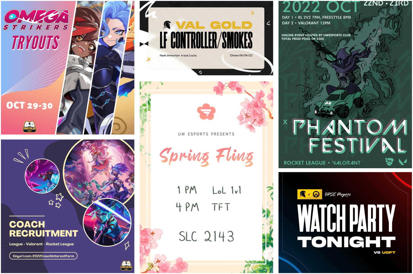
Previously, Warriors Esports lacked a cohesive brand identity as an organization. Prior to my involvement with Warriors Esports, their social media branding lacked consistency. They experimented extensively with various styles and themes for event promotions, resulting in a lack of cohesion among graphics, except for the presence of the Warriors Esports logo.
While I appreciate the importance of experimentation in design, the inconsistent nature of each graphic often caused confusion regarding event management and significance. As Warriors Esports transitioned into a formal organization, there was a clear opportunity for their social media presence to become more refined and be regarded with greater seriousness.
Previous Warrior’s Esports promotional graphics
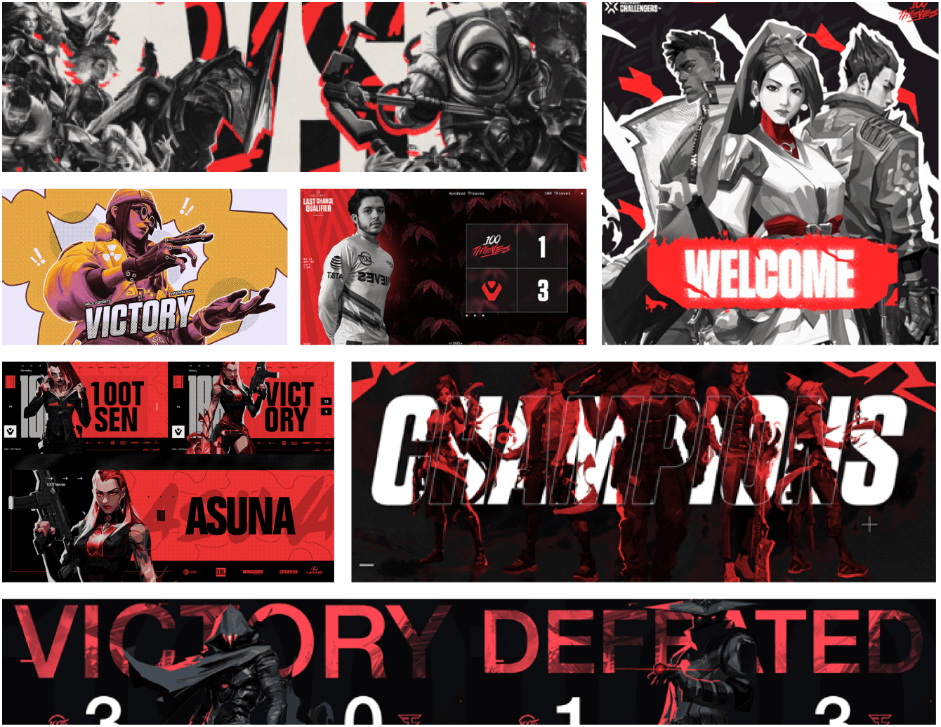
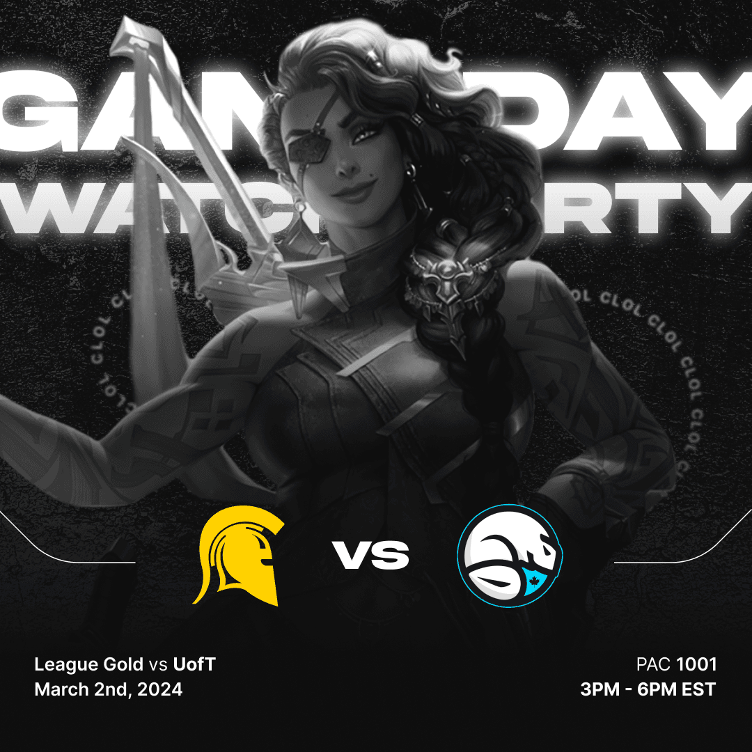
To enhance our branding, I brainstormed diverse ideas and looked into how professional esports teams refine theirs. Drawing inspiration, particularly from leading Esports organization, 100 Thieves, I observed a recurring trend in general esports graphics. To unify diverse characters from games with distinct color palettes while aligning with an organization's branding, they often rendered them in black and white, integrating accent hues reflective of the organization's color scheme.
Moreover, a prevalent trend involved the use of sans serif fonts, subtle incorporation of textures in image backgrounds, and a strong emphasis on depth in promotional graphics, irrespective of their specific purpose.
Rebrand Brainstorm
Title/Heading Fonts
When deciding font choices to establish a consistent brand identity for Warriors Esports, I had strongly gravitated towards using ‘Akira Expanded’, a modern, strong, serif display font that left a lasting impression on viewers. Coming across this font on Instagram reels, I deliberately made an effort to remember its name when downloading, highlighting its ability to make a memorable impression.
Body Fonts
Admittedly, I’m a huge fan of the font ‘Inter’, which is Figma’s default text font. Its ease of use coupled with its clean and modern design allowed for versatility while maintaining readability for Warriors Esports graphics.
The Results
—
VISUALS
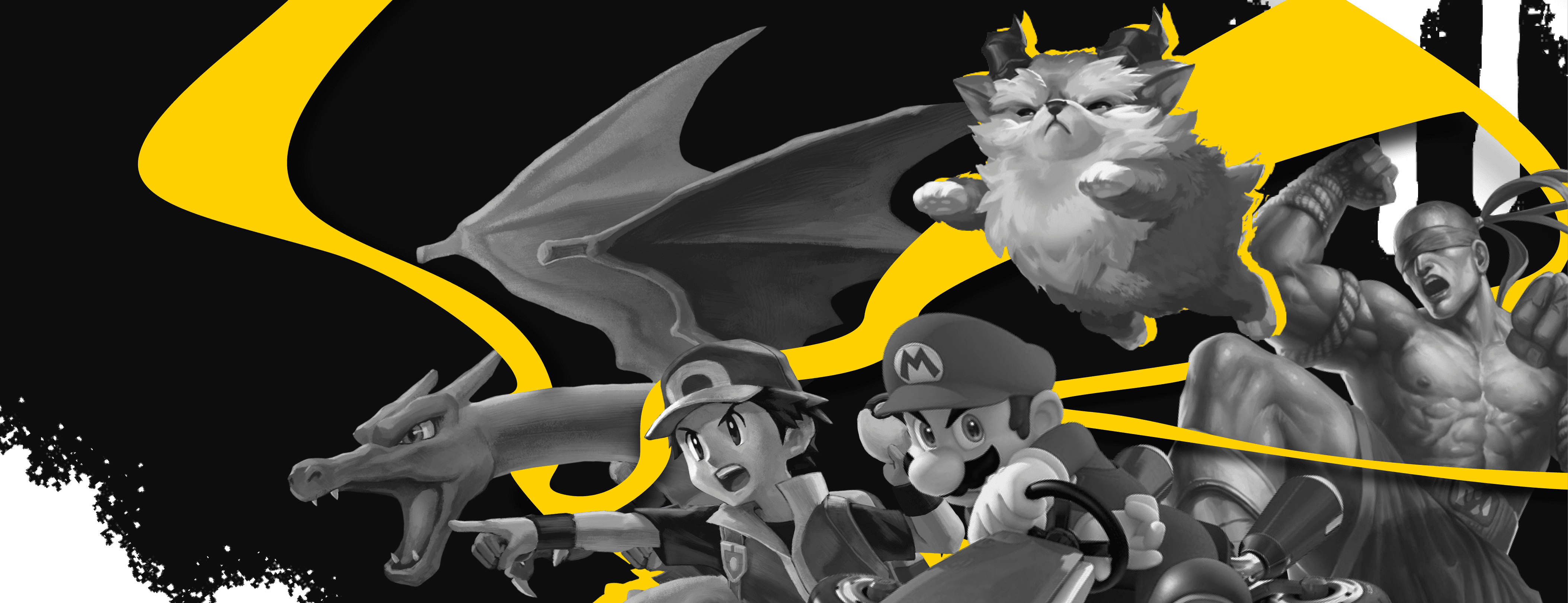
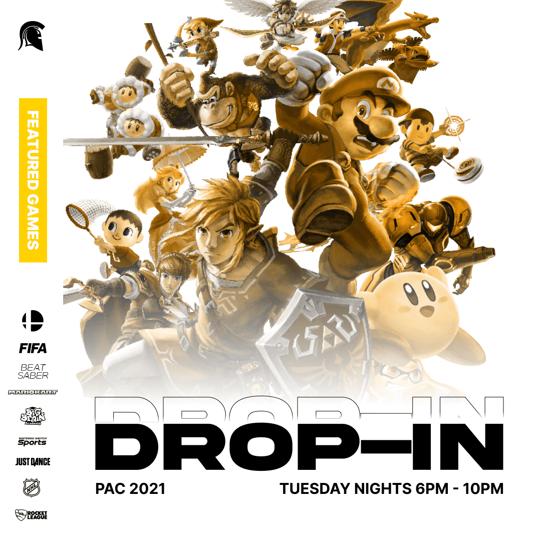
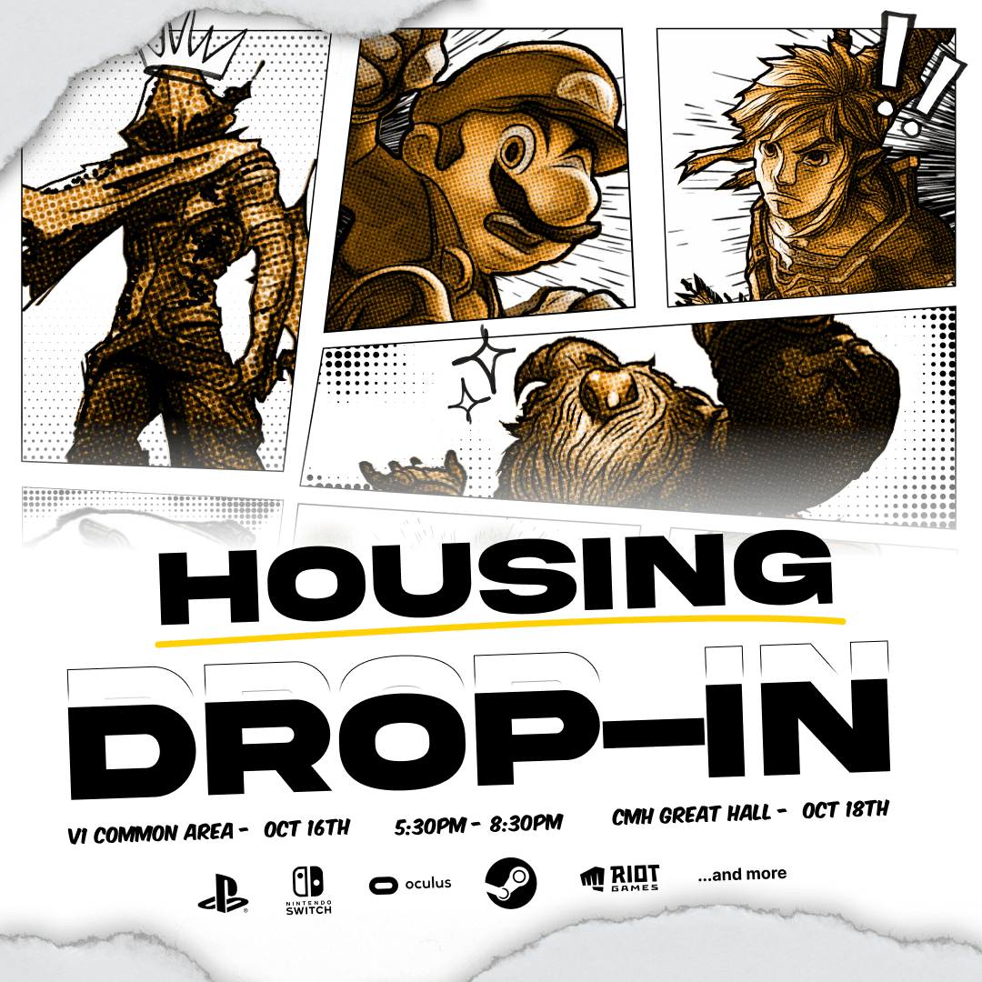
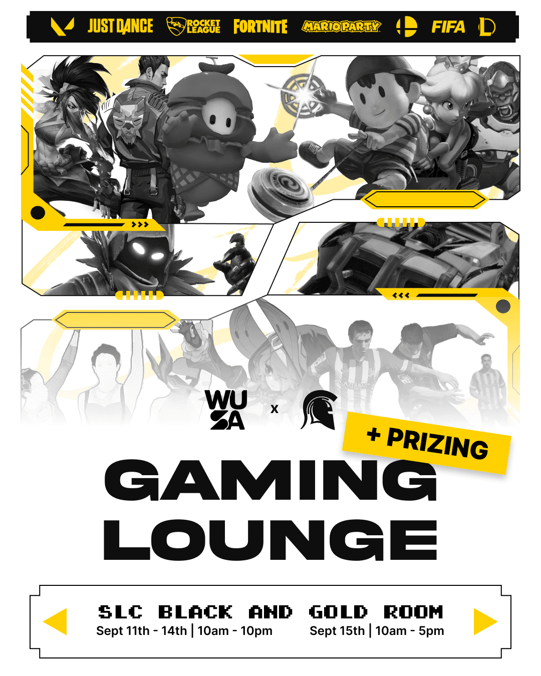
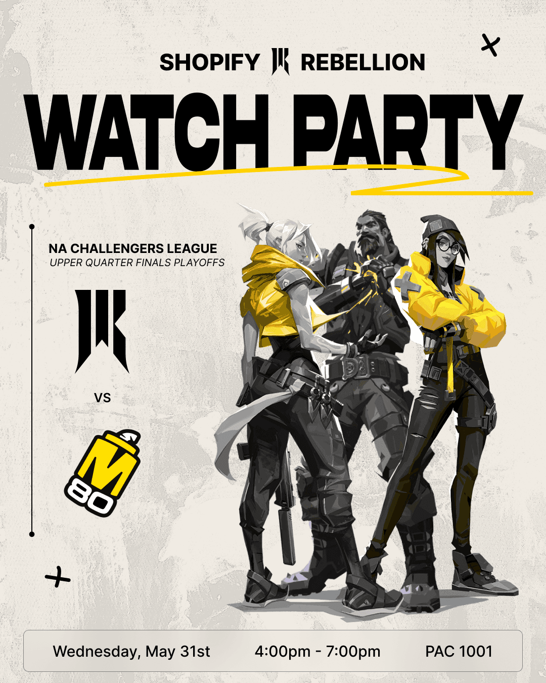
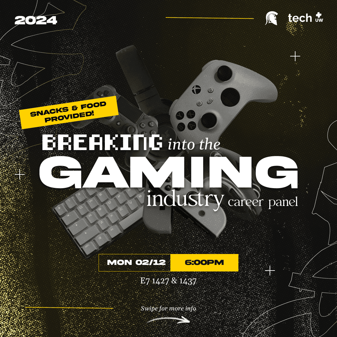
An influential aspect I drew from 100 Thieves was their strategic usage of shape to outline game characters or serve as decorative elements. By incorporating these shapes and accentuating them with a yellow hue (in alignment with the University of Waterloo's color scheme of black, white, and yellow), it enhances the visual impact of the graphics against the monochromatic backdrop of in-game characters.
This theme remained consistent in subsequent marketing materials for Warriors Esports, with minor stylistic adjustments, yet consistently highlighting Waterloo's school colors, fonts, and monochromatic imagery. Consequently, this enhanced recognition of our organization among followers, facilitating easy identification at events, social media posts, and other platforms.
—
STATISTICAL
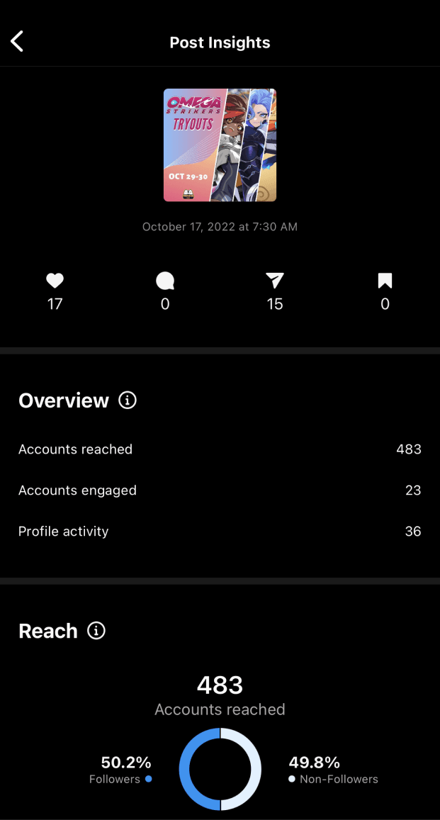
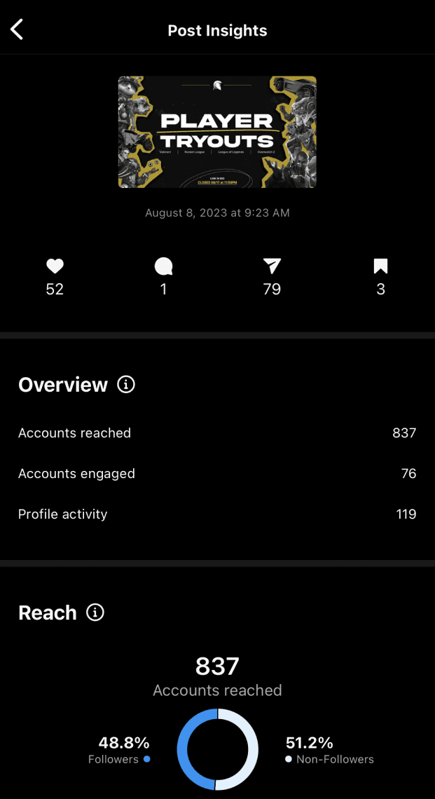
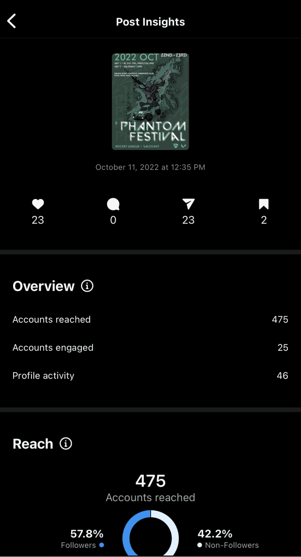
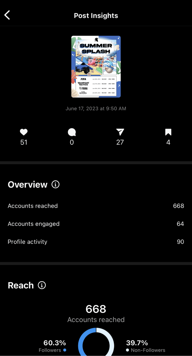
Through the rebranding efforts of Warriors Esports, we've witnessed a remarkable surge in user engagement on our social media platforms. This transformation has led to a significant increase in account reach, exemplified by a peak of 837 accounts reached with our new graphics, compared to 475 accounts with the previous graphics. Additionally, our posts are garnering an average of 23% more views, showcasing the effectiveness of our rebranding strategy in captivating our audience.
Previous Player Tryouts
Revamped Player Tryout Graphics
Previous Themed Event
Revamped Themed Event
Balancing creativity and brand consistency is key.
As we looked into creating unique designs for Warriors Esports on social media, upholding brand consistency was non-negotiable. In essence, I was determined to preserve brand integrity while fostering creative expression.
This led to combining new ideas while using what I already known had worked for our graphics, leveraging off of both experimentation and established successes.
Community is everything.
Extremely plain and simple. Yet still, this concept wasn't something I was familiar with until I had joined Warriors Esports.
You may wonder what this takeaway has to do with design or creating marketing materials, and to be frank, it has no direct correlation. I had realized at my time with such an open and loving community that the people you surround yourself with help propel you forward in life as a whole.
So ultimately, if it weren't for me landing this role as their Graphic Designer and them existing as amazing human beings, my outlook on life would have been vastly different than what it is now.

